LIVE BRIEF 5 VISUAL AND CONCEPTUAL RESEARCH |
Places as 'Brands'
I felt a good place to start was to look into the various cities/nations/places throughout the world that have been re-branded for economic development or tourism to evaluate the approaches that have been taken. Hopefully this will help to stimulate my thoughts towards how we can approach 'Capital North'.
London
http://saffron-consultants.com/work/london/
"One city – one voice
In 2010 Saffron was commissioned by London & Partners, the official promotional organisation for London, to create a branding programme that would bring together all the various bodies which represent London in the world – Visit London, Think London, Study London, Film London and so on and to create a platform that would enable them to raise the city’s profile globally. The brand needed to be flexible enough to enable all of them to use it in a way that was appropriate for their particular audience; at the same time, their activities and messages needed to be consistent enough to build and project a strong brand for London.
In a word - quirky
Of course London has many wonderful ‘things’ to shout about – but so do many other great cities. What makes London truly distinctive is its quirkiness: the understated, confident, self-deprecating style that anyone who knows London will recognise. So we put quirkiness at the heart of the brand and found a 100 ways to express the idea across all the key areas of tourism, inward investment, culture and education. As the Economist recently put it, “The more interconnected the world is, the more people crave a sense of place – the more distinctive and unusual the better”. The Olympic Games in 2012 represented London’s first major public outing since the set-backs from previous years – and the general feedback from even the harshest critics seems to be that the world’s greatest city is in rude health again. Adopted so far by a number of agencies including London & Partners, Visit London and, most recently, the Mayor of London, the brand looks set to be the public face of the city for years to come."
I think the simpleness of this approach communicates really clearly and consistently but also allows for flexibility of the message. It relies entirely on words as apposed to imagery to engage the audience which means there are no distractions and it is straight to the point. The slight quirkiness works really well to create a playful and peculiar allure but the cleanliness of the aesthetic also communicate more serious attributes such as pride and strength.


New York
http://archive.wolffolins.com/work/new-york-city?ghost=1
"Ambition
There’s only one New York City. But within that one city are five boroughs, approximately 191 neighborhoods, nearly a million buildings and over 8.2 million people. Each individual has his or her own New York.
Within the mind of every New Yorker resides a different version of New York City. It's a place loved in 138 different languages and viewed through an almost infinite mix of cultures, ideologies and ways of life. Everyone living side by side.
This kaleidoscopic quality is one of the great things about this city. It's the very thing we love. But it also makes it difficult to represent. There is no one symbol, no one logo or brand that means New York City to everyone.
Action
To create a brand for New York City, the challenge was not to define a purpose, but to capture an essence. This was articulated by the idea: "only one, but no one NYC."
The resulting brand identity has now been embraced not just by New York City's official marketing, tourism and partnership organization, NYC & Company, but across many city departments."


"Amsterdam has long been a required stop on any European Grand Tour. But in the early 21st century, the city of Amsterdam noticed its position on various international rankings—top tourist destinations, top convention cities, etc.—had fallen due to increased competition from other destinations in Europe, particularly to cities in Spain and Eastern Europe. To maintain the city’s position as a top spot for tourism and business, a private-public partnership was formed to rebrand Amsterdam with a new city marketing campaign. In September 2004, I amsterdam was born. I Amsterdam is a motto and a brand all in one for both the people of Amsterdam and the city itself.
We’re all familiar with commercial brands, but what does it mean to brand a city? According to Saffron Brand Consultants, creators of the Saffron European City Brand Barometer (pdf), the “brand” of a place is “the average or common perceptions and associations people have with that place.” It is, of course, a subjective perception based on personal taste and experience but, generally speaking, there is a definite cultural awareness of cities—the idea of a city—that is shaped by media and marketing.
It was the hope of Amsterdam Partners, the public-private partnership formed to market the capital of the Netherlands, to expand and slightly alter that cultural awareness by focusing on what they identified as the core values of their city: creativity (creativiteit), innovation (innovatie), and its spirit of commerce (handelsgeest).
Amsterdam is not just about sex, drugs and canals. It’s also a great place to live and work. The minds behind I amsterdam believe that their brand can not only serve to spread awareness about the virtues of their city, but also act as a catalyst for real urban change, noting in their promotional materials that “the building blocks of city marketing will likewise be building blocks for important parts of city policy.”
To that end, they wanted a diverse branding concept that would appeal not just to tourists, but to those living in the areas around Amsterdam, as well as to the businesses and individuals in the city proper. Previous city slogans such as “Amsterdam Has It” and “Capital of Sports” and “Small City, Big Business” were either too vague or too focused on one aspect of the city to the detriment of others. “I amsterdam,” however, as has the specific, instantly recognizable quality of Milton Glaser’s famous “I <3 NY logo”, from which it most certainly drew some inspiration. But instead of hearting its city, I amsterdam invites you to become a part of it: I amsterdam and you can be too.
“I amsterdam is the slogan for both people and area. I amsterdam allows the people to voice their pride and confidence while expressing support and love for their city. I amsterdam can be used in many ways, but must always come from the people; this is the slogan’s true power. The people who live here, the people who work here, the people who study here, the people who visit here and the people who come to Amsterdam seeking a better future are, in the end, the best evidence for why Amsterdam is a city of choice. I amsterdam should embody the spirit of Amsterdam, and therefore its use will create a city brand recognized the world over.”
It shares with Glaser’s logo a certain a timeless quality and product-friendly design, perfect for extending the well-regulated brand, which Amsterdam Partners hoped would be embraced by local organizations and businesses as part of their own marketing campaigns."
Reminds me entirely of the I LOVE NEW YORK campaign and the logo designed by Milton Glaser, but obviously such a strong concept like that is going to be copied in some way or another. Its simpleness allows for clear communication and the fact that big installations of it are situated throughout the city allow for much engagement and means it is impossible to ignore. The concept creates a sense of pride for the people that live there and shouts 'we are here!', making people want to find out more.

Melbourne
http://www.melbourne.vic.gov.au/Pages/default.aspx
http://landor.com/#!/work/case-studies/melbourne/
"City of Melbourne is a dynamic, progressive city, internationally recognized for its diversity, innovation, sustainability, and livability. City of Melbourne council supports the city’s world-class offerings, represents it nationally and internationally, and ensures it remains a preeminent Australian center for culture, arts, dining, entertainment, education, and shopping. Since implementing its previous identity 15 years ago, City of Melbourne has experienced significant change. As a result, the council had accumulated a range of isolated logos for various services, which had become increasingly difficult and costly to manage. The fragmentation of City of Melbourne’s identity meant equity was driven away from the core brand, and the council realized that it needed a long-term solution.
City of Melbourne asked Landor to develop a cohesive brand strategy and new identity system. The challenge was to reflect City of Melbourne’s cool sophistication on the world stage, capture the passion of its people, and provide the city with a unified, flexible, and future-focused image. The new identity needed to overcome political complexities, improve the cost-effectiveness of managing the brand, and unite the disparate range of entities (including the council, City of Melbourne’s destination brand, and an ever-growing portfolio of different initiatives, programs, services, events, and activities).
We built the branding program based on the results of a thorough audit of City of Melbourne’s various identities and its long-term sustainability and strategic plans. The audit assessed public opinion and interviewed stakeholders who included local government officials, business owners, and community representatives. At the heart of the new design, the bold “M” presents a full expression of the identity system - immediately recognizable and as multifaceted as the city itself: creative, cultural, sustainable. A celebration of diversity and personal interpretation that is both future-proof and iconic."
Definitely one of the most obvious examples to be looking at but without a doubt one of my favourites. The infinite adaptions explode with beautiful and assertive expression, whilst the big, jagged geometric 'M' act as an instantly recognisable container to bring structure and consistency to the 'brands' identity. Innovative, engaging, enticing, futuristic, dynamic, creative.


Turkey
http://saffron-consultants.com/work/making-made-in-turkey-mean-more/
"Why is ‘Made in Turkey’ better?
Saffron has been working with the Turkish Exporters Assembly on a business/investment/export-oriented brand for Turkey. The central question guiding our work together has been what “Made In Turkey” means in a global context. How is it different or better than “Made In China” or “Made In Germany”? What competitive advantage can Turkey claim for itself as it competes with these nations?
A focus on adaptability
Saffron’s work for Turkey puts a big focus on the ability of Turkish businesses to adapt to rapid change and provide customers with great levels of attention. The brand idea “Masters of Change” speaks of the many changes that Turkey has historically experienced. The resulting ability Turks have to accomodate foreign cultures and the need for flexibility in their products and services is highly differentiating. The visual solution is an expression of the many industries in which this brand idea is brought to life by Turkish companies. The slogan that Saffron developed, “Discover the potential” is the customer-facing translation of the brand idea. It invites potential investors to engage with Turkey and see for themselves what a difference Turkey can make to their business.
Increasing coherence and cohesion
As a unifying element, the new brand helps the various groups inside the Turkish Exporters Assembly behave and communicate in a more cohesive way inside and outside of Turkey. A more coherent idea of what “Made In Turkey” means is thereby emerging. The new brand along with the visual identity was launched by president Erdogan on 28 September 2014 to local and international press. Over the next months, the Turkish Exporters Assembly will be rolling the programme out across its various parts and international locations."


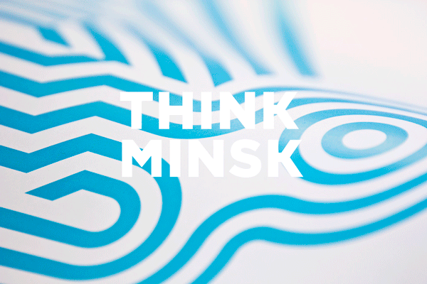
Minsk
Despite being a national capital and a city of considerable size (a population of nearly 2 million) Minsk lacked a clear identity. Its residents define themselves mostly by nationality and admit that Minsk does not have a particular culture or tradition of its own.
INSTID was asked to help improve international recognition of Minsk to aid it in attracting foreign investment, visitors, and talent. Within the city itself, the task was to help residents to feel proud of Minsk and open up a unique city culture based on their distinct character. In doing so we would create a powerful platform for city’s future development.
INSTID was asked to help improve international recognition of Minsk to aid it in attracting foreign investment, visitors, and talent. Within the city itself, the task was to help residents to feel proud of Minsk and open up a unique city culture based on their distinct character. In doing so we would create a powerful platform for city’s future development.
Archetypal Function as Brand Core Idea
Think Minsk Instead of reflecting on multiple dimensions of the city’s life, the brand strategy captured Minsk’s essential quality – the ability to rationalise, engineer, and create effective practical solutions to complex technological and scientific problems. This quality is deeply ingrained in Minsk residents, many of whom are third generation engineers. It manifests itself in the user-friendly layout of the city and the way the city rhythmically and reliably works. It also propels a burgeoning industry of software programming, engineering, and high-precision manufacturing that has emerged in Minsk over the last two decades.
The core idea of Minsk as a city of intellect is expressed in the slogan Think Minsk. It sends a clear message to foreign investors, tourists and talent that Minsk welcomes and fosters knowledge-based production and exchange of ideas. It gives a direction for the city’s development and propels Minsk towards becoming a new growth centre in the global economy.
A graphic expression of this archetypal quality of Minsk is delivered by the combination of the light blue colour (the colour of communication, abstract thinking, and intellect), and the line (as a most flexible and effective shape). Given the lack of any common symbols for the city at present we decided against a fixed decorative graphic symbol. Rather, we defined clear, laconic, abstract tenets of the Minsk visual style in order to channel the huge potential of creative energy of Minsk residents. In other words, we designated alternating blue and white stripes of equal width as the key and only imperative for the city visuals and opened them to the Minsk residents, businesses and public bodies to interpret and use."


The PCVB wanted to improve how to communicate the comprehensiveness and value of what they deliver and its impact on the Philadelphia economy and brand. Print and online communications tools were not differentiating the city brand and, as a whole, appeared inconsistent.
Solution
Solution
ex;it created a brand strategy document to guide PCVB on how to differentiate its identity and establish a compelling presence in the community, while presenting an engaging perception of the city. The PCVB should feel like it IS Philadelphia and create a new level of visual excitement about the city and region. All communication materials will take their lead from the brand architecture and language to reinforce the culture, quality and spirit of the organization.
All of ex;it’s recommendations were a result of a rigorous series of interviews and work sessions with stakeholders, staff, advisors and board of directors, members, convention attendees, tour operators and tourists.
The brand strategy informs the design direction. As a result, PCVB’s new logo and communication tools reflect the current and future state of the organization’s beliefs, culture and capabilities. A Brand Guidelines Manual will support the PCVB with brand management."


OCAD University
http://www.brucemaudesign.com/work?project_id=59
"In 2011, OCAD University, Canada’s pre-eminent art and design school, needed a new visual identity. The new identity had to reflect a 135-year-old institution moving quickly into the future.
The BMD team worked collaboratively with OCAD U staff in an intensive research and engagement phase. We involved students, alumni, faculty and staff. We felt that the visual identity needed to be a true reflection of what we heard and saw during that phase. OCAD is an inclusive, vibrant and vital institution built on creativity, risk and innovation.
BMD created a dynamic and modular identity. Each year, the school invites a select group of graduating students to design a logo within the basic window framework. As OCADU grows and matures a living library of identities will emerge, recording the ideas and aesthetics that shaped that time."


Latvia Expo 2010
"Already three months active and remaining open until the end of October, the 2010 Shanghai World Expo has attracted as many as 500,000-plus visitors (or as low as 80,000-plus) per day with pavilions representing 195 countries, all working under the theme of “‘Better City, Better Life,’ representing the common wish of the whole humankind for a better living in future urban environments.” One pavilion that has taken this theme to extreme heights is Latvia, who is treating visitors to its Technology of happiness, a three-story structure wrapped in 100,000 colorful, transparent, 15 ×15-centimeter plastic plates that houses a vertical tunnel that shoots people up in the air with, you bet, happiness. The Latvia pavilion even has its own happy identity, created by Latvian design firm Asketic.
The Latvia Pavilion’s concept is that they are transforming themselves from a “black box” that could get lost in the shuffle of 195 countries vying for your attention into, well, a factory of happiness.
I haven’t stepped into the wind tunnel but this identity is enough to make me happy. This is a lovely new take on flexible identities that really forms a complete visual language that doesn’t rely on a repetitive formula. What’s interesting is that at times the identity looks almost “dumb,” too simple and basic. But it has a strong, vibrant energy that makes it quite entertaining, and I relish that it doesn’t rely on shading to communicate dimension and depth. In its visual abundance it is surprisingly minimalist. It’s a shame that it’s only for a six-month project and not a larger, longer-lasting project."


Latvia Expo 2015
http://www.latviaexpo.com/en
"The main theme of Expo Milan 2015 is Feeding the Planet, Energy for Life. According to the guidelines for participants, countries can also choose one of the sub-themes. Latvia has decided to work with Food and culture for better life.
We created a concept for Expo 2015 pavilion of Latvia and its graphical identity which we can name in two words – Nature Inside –, a deliberately chosen paraphrase of the high-tech brand tag line.
We are convinced that Latvia finds the Energy for Life in balance between the material and the immaterial, nature and production. Latvia can enrich the world through this harmony. In 2012, Yale and Columbia universities named Latvia as the second greenest country in the world on the Environmental Performance Index (EPI). At the same time, Latvia still is one of the fastest growing economies in Europe."


Carrara
Torikorttelit
"Torikorttelit – the old city centre of Helsinki – is where tomorrow’s Helsinki is created and experienced. It is a platform that gathers together doers and feelers. At Torikorttelit everyone can join in creating a new city – little by little, deed by deed. It is a place where the people can transform their city into a more courageous, more exciting, more open, more shared, and even more cherished Helsinki.
The visual identity was designed to communicate the new vivid and diverse city. It is a combination of the history of the old merchant area, the progressive beat of the city today and visions for the future. The classic stripes and the Helsinki colour palette together with the modern typography create a bold look and feel for all communications from spatial design to marketing. The identity speaks volumes about the diversity, the layers of architecture and of the attitude with which the area is taking its place in Helsinki as a catalyst for new things to come. Its objective is to create awareness for the events, experiences and opportunities that lie at the heart of Torikorttelit.
Kokoro & Moi has also been involved in developing the action plan and programme for the area. The visual identity extends from the logo to information graphics and signage, from advertising to physical and digital environments, and from printed matter and stationery to publications – among other things."
OCAD University
http://www.brucemaudesign.com/work?project_id=59
"In 2011, OCAD University, Canada’s pre-eminent art and design school, needed a new visual identity. The new identity had to reflect a 135-year-old institution moving quickly into the future.
The BMD team worked collaboratively with OCAD U staff in an intensive research and engagement phase. We involved students, alumni, faculty and staff. We felt that the visual identity needed to be a true reflection of what we heard and saw during that phase. OCAD is an inclusive, vibrant and vital institution built on creativity, risk and innovation.
BMD created a dynamic and modular identity. Each year, the school invites a select group of graduating students to design a logo within the basic window framework. As OCADU grows and matures a living library of identities will emerge, recording the ideas and aesthetics that shaped that time."
Latvia Expo 2010
(Cannot find original source, soz like)
The Latvia Pavilion’s concept is that they are transforming themselves from a “black box” that could get lost in the shuffle of 195 countries vying for your attention into, well, a factory of happiness.
I haven’t stepped into the wind tunnel but this identity is enough to make me happy. This is a lovely new take on flexible identities that really forms a complete visual language that doesn’t rely on a repetitive formula. What’s interesting is that at times the identity looks almost “dumb,” too simple and basic. But it has a strong, vibrant energy that makes it quite entertaining, and I relish that it doesn’t rely on shading to communicate dimension and depth. In its visual abundance it is surprisingly minimalist. It’s a shame that it’s only for a six-month project and not a larger, longer-lasting project."
We created a concept for Expo 2015 pavilion of Latvia and its graphical identity which we can name in two words – Nature Inside –, a deliberately chosen paraphrase of the high-tech brand tag line.
We are convinced that Latvia finds the Energy for Life in balance between the material and the immaterial, nature and production. Latvia can enrich the world through this harmony. In 2012, Yale and Columbia universities named Latvia as the second greenest country in the world on the Environmental Performance Index (EPI). At the same time, Latvia still is one of the fastest growing economies in Europe."
(Proposal only! Not real)


