Showing posts with label MOO. Show all posts
Showing posts with label MOO. Show all posts
COMPETITION BRIEF FINAL VIDEO |
I did encounter many problems, the main one being the size of my composition. For some reason I had not fully considered where and how this animation would be used, and created my composition at a very awkward size. Instead of working from a standard video size I had created my own, meaning that it is not going look perfect in a video player. Unfortunately I had taken the development way too far and didn't have enough time to make it the right size so had to stick with what I had.
A second problem was timing. I had not properly considered how long sequence should last, and once I had added sound realised the thing as a whole seemed quite rushed. The music makes it seem like it should go on for much longer, but once again I had taken it too far to backtrack on this.


COMPETITION BRIEF ANIMATING |
I developed very brief storyboards so they could inform the animation process, and then began animating Although I had followed a couple of tutorials to learn the basics of what I wanted to do, most of it was pure trial and error and experimentation, therefore took me forever!
SEQUENCE 1.

This gif shows how a mask the same colour as the background moves to reveal the text underneath, therefore making it look like it is being drawn. I was not happy with how the composition looked with the grid just sat there on the opening of the sequence, and could not figure out how I could make it animate well, so I decided to remove it.

Looking separated at how Tim was rigged -

This is a gif of the final first sequence - I created a version with a fade in and out as I felt this would be the best way for it to transition into the following sequence.


SEQUENCE 2.


Rigging Ronnie and Baldrick - love the eyebrow movement


Bringing everything together -


This gif shows how I have used the simplest animation techniques to create all the movements - positioning and scale for the bubbles, scale for the 'O', rotation for the lever, gauge, and clock hands, and opacity for the moving pipes. The trickiest part of this was getting all the timing right but it is most definitely my favourite sequence.
Rigging Ronnie and Baldrick - love the eyebrow movement
Bringing everything together -
SEQUENCE 3.
This Gif shows how much of a huge pain in the arse this sequence was. Each particles needed its own individual path to follow and I was cross-eyed by the end of it. There will definitely be an easier and probably better way to do this but I could not find it at the time. (Colour has changed slightly)

Full third sequence with and without fade -
SEQUENCE 4.
I created a final sequence that presented the MOO logo and a link to their website -
COMPETITION BRIEF ANIMATION PRACTICE |
From my brief tutorial in after effects I actually felt really confident in doing everything that I had planned except for the movement in the first sequence. I had decided that I wanted the type to draw itself onto the grid structure, so found some tutorials on how I could do this and followed them.
These were my 3 practice tries just to see which worked the strongest.
These first to variations use the stroke effect, where a stroke is created from the vector and is drawn out.


This sequences uses a mask that is drawn over the vector ( was very difficult to draw!) and then is taken away to reveal the image below.

Although the most difficult to create, I decided the 3rd variation was the one I wanted to pursue.
COMPETITION BRIEF FINAL DEVELOPMENT |
Once again I created a new final colour palette that stripped the design back to 3 primary colours and then a selection of secondary colours that would work with each. I felt the blue, purple and red were strong as a set and engaging.
FINAL COLOUR PALETTE
PRIMARY.


FINAL DESIGNS (NO GOING BACK NOW)
BACKGROUND.
PRIMARY.
FULL.
I then tweaked my designs to fit this new palette and simplified them until I was happy.
FINAL DESIGNS (NO GOING BACK NOW)
BACKGROUND.


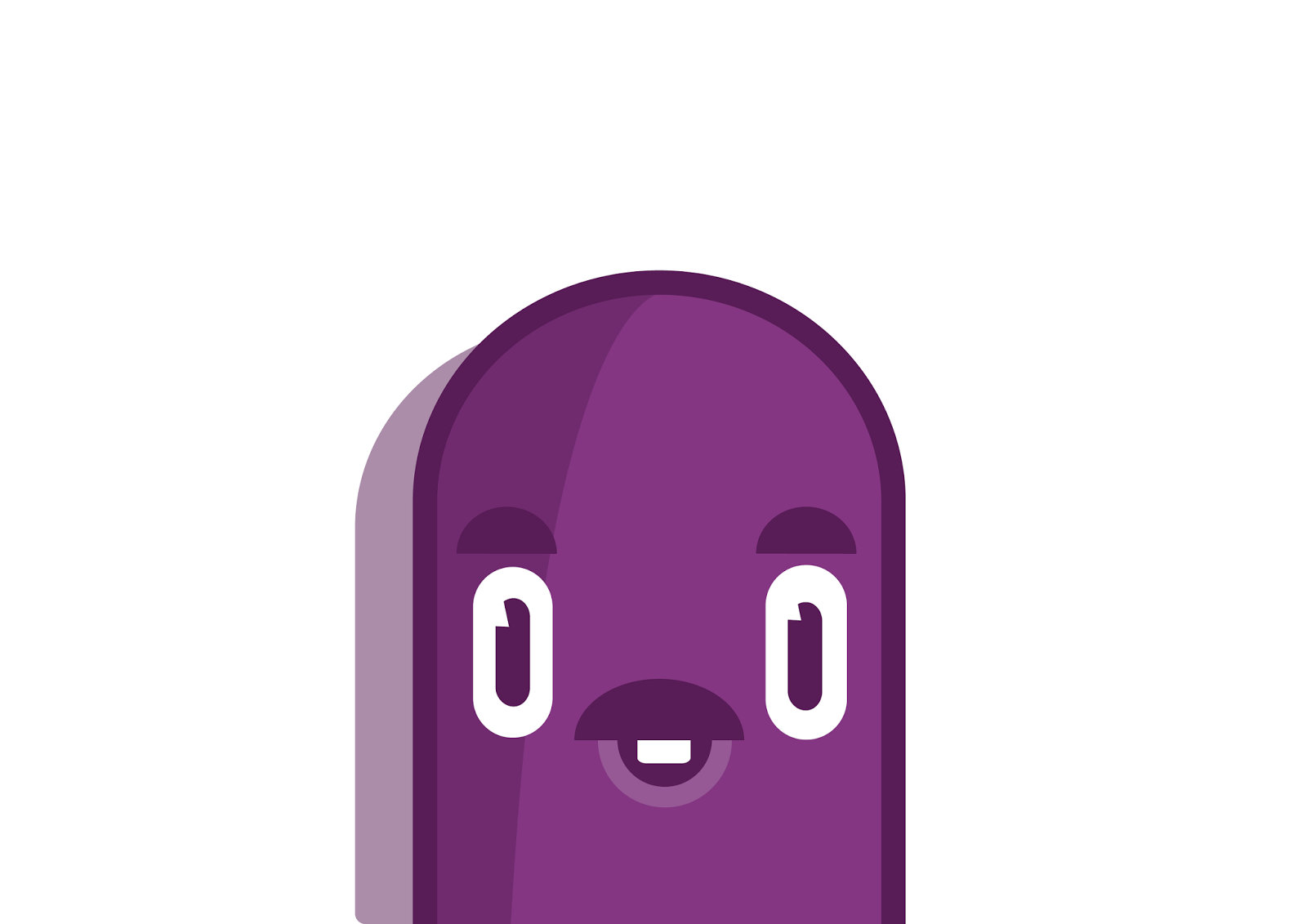
I also re-designed my characters and named them accordingly...
CHARACTERS.
Tim.


Ronnie.

Baldrick.


Nigel.


FULL STATIC SEQUENCES.


COMPETITION BRIEF FURTHER DEVELOPMENT |
SKETCHES


From here I then began sketching out my initial ideas. I made the decision I wanted to create something that works static but also something that could be animated. The fact the strap line is about something 'working', I feel the perfect way to represent this would be through movement.
As well as this I decided that my response would work around type and image - either breaking up the strap line into the 3 words and visualising each individually or creating one full image.
As MOO proclaims to be 'playful' I decided this would be the underlying theme throughout my response.
I decided that the best route to take would be to split the strap line into the 3 words and visualise each individually.
I liked the idea of 'Design' being a process and something physically structural - something that is measured, considered and thought about - not something that is just done. This led me to the idea of grid work and blueprint, so began thinking about how this could work - especially as an animation.
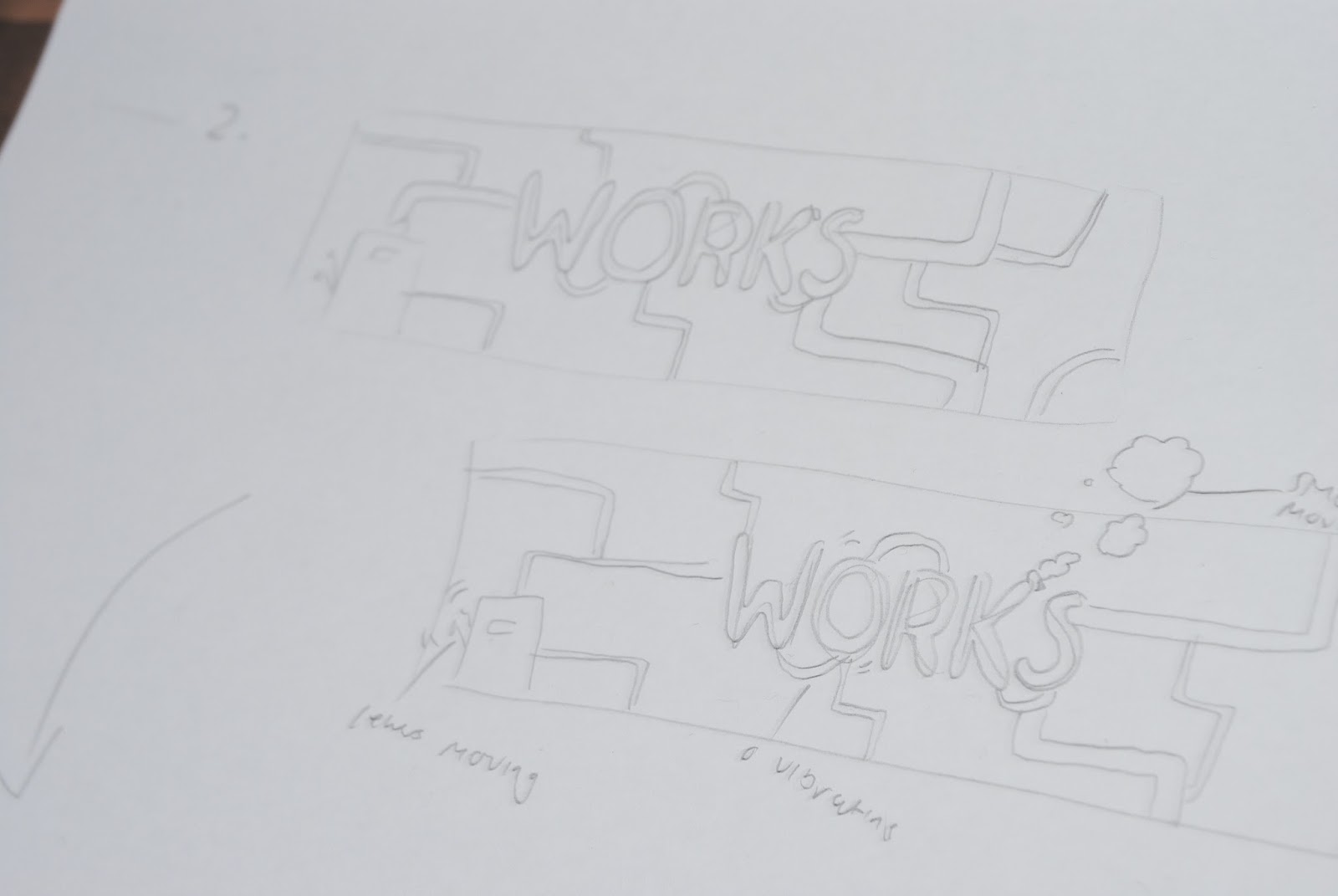
In terms of 'Works', I was immediately drawn to the idea of machinery or factories. I felt this was a really strong (maybe obvious but...) way of representing it - things working! I also felt this would be really engaging as an animation.
In terms of 'Wonders' I began thinking about things that are wonderful. I was led to the idea of particles - floating around wonderfully. The sun was shining through my window onto my desk, and my room desperately needed a clean/hoover. I could see all these particles (dead skin and dust...) floating around and it really intrigued me the way they were moving. I felt it would be really cool and interesting to bring this movement into my animation. I started thinking about a fantasy world with particles floating around it and felt this would be the perfect solution.
From here I began thinking about how my response would work as a set and how each sequence would work individually. Keeping on the theme of playfulness I decided that I really wanted to have some moving characters in the design - mainly because I had wanted to animation characters for a while but also because i felt it could bring some kind of humour.
These were my 3 final layouts for the sequences -
DIGITAL DEVELOPMENT
Looking at the original colour scheme for the MOO brand, I came to the conclusion that it wasn't very nice at all and kind of restricted my create freedom. Together as a set they didn't really work well and I was struggling to find more than a set of 2 that complimented each other. I decided I wasn't doing this brief primarily to win so following their guidelines to a t wasn't my main concern.

With this in mind, I decided to develop my own MOO colour palette, briefly basing it around the original colours but as more of a complimentary and harmonious range.

I then began building the sequences digitally, experimenting with different colour schemes. I felt flat vectors were the most suitable route to go in terms of fitting with MOO's visual identity and being something I am confident in creating and attempting to animate!
I also used the typeface MOO provided but created my own bulkier version.
*PLEASE WAIT FOR ISSUU DOCUMENT TO LOAD!
SEQUENCE 1
SEQUENCE 2
SEQUENCE 3
CHARACTER DEVELOPMENT
Although probably not the correct way to go about things I developed the characters separately and decided to try and work them around the designa.

*PLEASE WAIT FOR ISSUU DOCUMENT TO LOAD!
FINAL FOUR DESIGNS


Due to me spending much longer on this than planned and because I had been staring at it for every day and night for a week, I decided that I wasn't happy with it anymore. I continued to experiment with colours for a ridiculous amount of time, which then led me to take the images out of a flat vector format and give them a 3D effect (I had been looking at 3D work online I think this was why). Here are some of the many variations of these I produced -


I really really liked these even as static images and felt they were really strong in terms of something visually engaging and exiting.
The problem is that I have created these in illustrator using blurs and shadows, and it is not actual 3D rendered imagery using 3D software, therefore to make this move realistically will be a real challenge and also I would need the characters to be 3D as well. Another thing is that if this is going to work as a gif it will be pixelated due to the mass of colours.
I have decided to spend one more day developing the design and the colour scheme and then I am going to HAVE TO stop changing my mind and animate it!
Subscribe to:
Posts (Atom)