STUDIO BRIEF 4 REFERENCE IMAGERY |
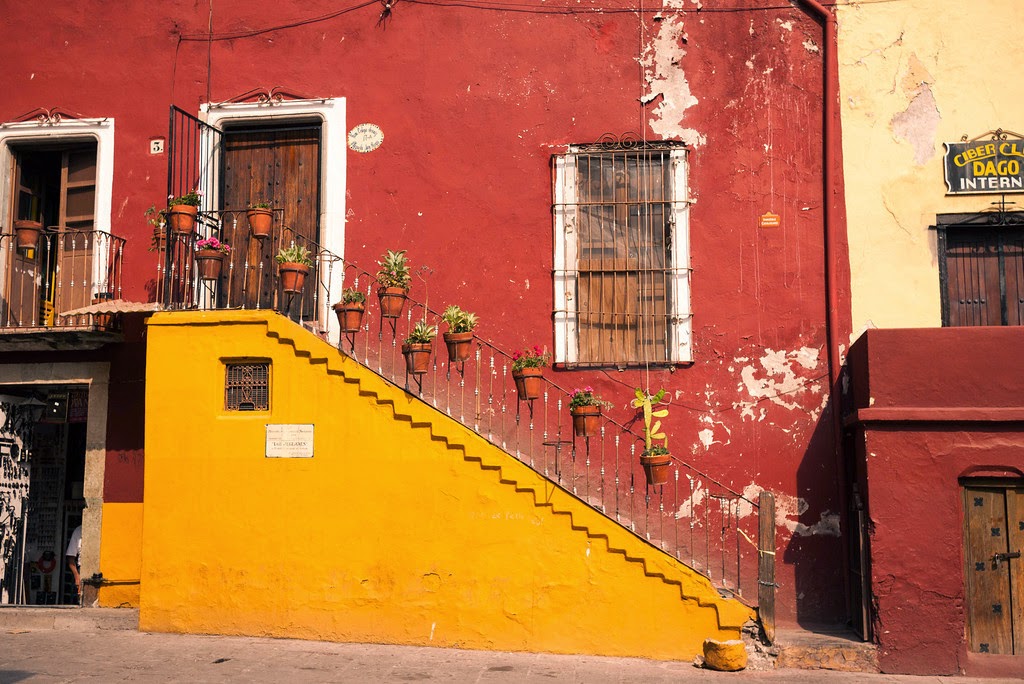
I initially thought it would be good to begin by gathering images of the food itself. I felt this would be a good source of inspiration in general, and especially in terms of colour choices, but I later decided that it was quite pointless as I know what Mexican food looks like and I should be more concerned with the culture as a whole.
I started looking into Mexico and it's culture, which then led me to traditional Mexican sign painting. I really liked the imperfect decorative hand rendered type and the contrast of this against its surroundings.
I began collecting images of urban Mexican and other hispanic street typography that stood out to me. They varied quite a bit in style but they all seemed to create the same sense of excitement and vibrancy - bold, colourful letterforms and rough application.


Running theme of 'shadowed' text - something to consider
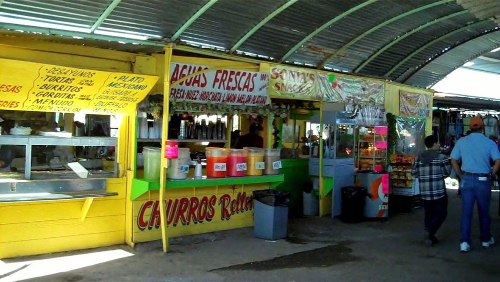


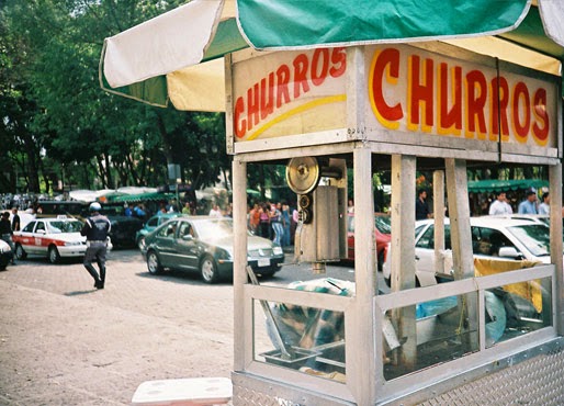


Really like the font used on these market stands -
Jon Garza Mexico-inspired illustrations - really quick, colourful & engaging. I think they fit really well with the idea of street food.


Posters and illustration -
Kind of away from the subject of type I found these posters. I think these hand-rendered hispanic artworks are amazing. The imperfect illustrative aesthetic and cut & paste style really inspires me and emphasises the cultures vibrance really well. Could be interesting to try and incorporate this kind of thing into the identity.


Migues Mejia - 'Nuezz' -
As I really want to emphasise the idea of Mexican street culture, I began looking at their street art and artists. I found this guy - Nuezz, and fell in love with his work. I think the context and style of his street paintings have Mexico written all over them - day of the dead kind of, folkloric inspired art with a modern twist. I really think bringing something like this into the project could really develop it into something thats down with kids, unconventional and 'street'...


Finally just looking at the vibrancy of Mexico and Mexican culture as a whole -