STUDIO BRIEF 1 NORTH LUNA |
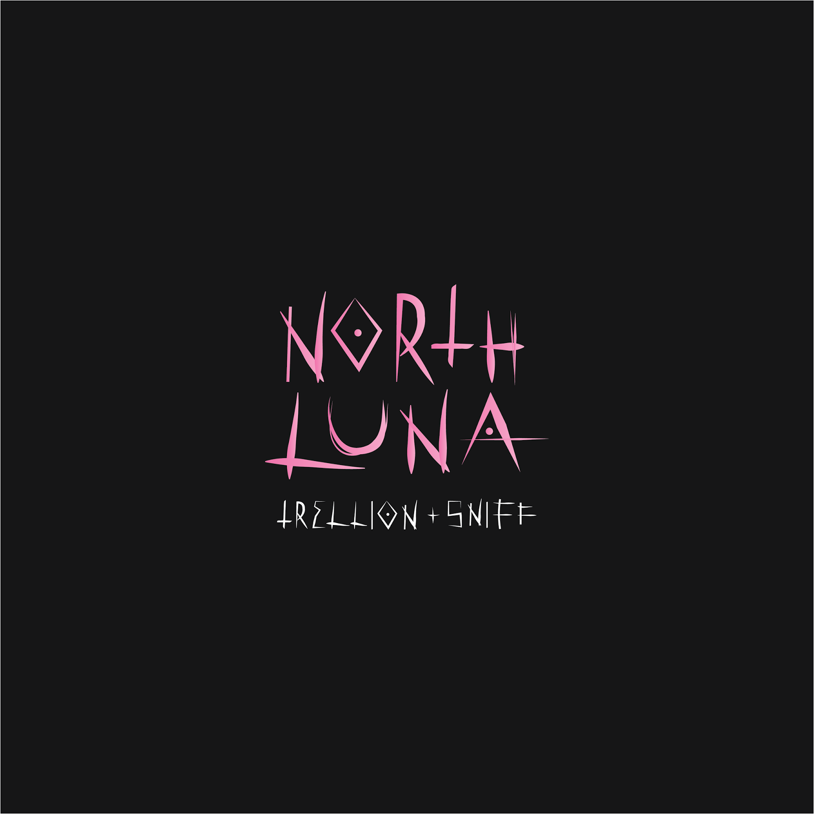
Developing typography - inspired by voodoo symbols and marking -


Whilst experimenting with text, I began thinking about how this would be printed. The record is limited edition, so in my opinion it needs to look special! I thought about screen print but acknowledged that it would be a lot of work to achieve the same aesthetic as the digital design.
I think I definitely need to consider a way in which I can add more depth and distinction to the image if I were to digital print.
-Spot varnishing over black outlines?
-Spot varnishing characters?
-Spot varnishing text?
-Embossing/debossing imagery?
-Embossing/debossing text?


