COMPETITION BRIEF FURTHER DEVELOPMENT |
SKETCHES


From here I then began sketching out my initial ideas. I made the decision I wanted to create something that works static but also something that could be animated. The fact the strap line is about something 'working', I feel the perfect way to represent this would be through movement.
As well as this I decided that my response would work around type and image - either breaking up the strap line into the 3 words and visualising each individually or creating one full image.
As MOO proclaims to be 'playful' I decided this would be the underlying theme throughout my response.
I decided that the best route to take would be to split the strap line into the 3 words and visualise each individually.
I liked the idea of 'Design' being a process and something physically structural - something that is measured, considered and thought about - not something that is just done. This led me to the idea of grid work and blueprint, so began thinking about how this could work - especially as an animation.
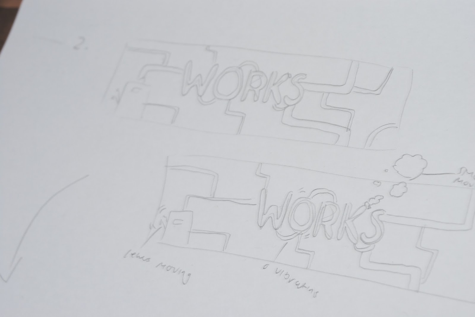
In terms of 'Works', I was immediately drawn to the idea of machinery or factories. I felt this was a really strong (maybe obvious but...) way of representing it - things working! I also felt this would be really engaging as an animation.
In terms of 'Wonders' I began thinking about things that are wonderful. I was led to the idea of particles - floating around wonderfully. The sun was shining through my window onto my desk, and my room desperately needed a clean/hoover. I could see all these particles (dead skin and dust...) floating around and it really intrigued me the way they were moving. I felt it would be really cool and interesting to bring this movement into my animation. I started thinking about a fantasy world with particles floating around it and felt this would be the perfect solution.
From here I began thinking about how my response would work as a set and how each sequence would work individually. Keeping on the theme of playfulness I decided that I really wanted to have some moving characters in the design - mainly because I had wanted to animation characters for a while but also because i felt it could bring some kind of humour.
These were my 3 final layouts for the sequences -
DIGITAL DEVELOPMENT
Looking at the original colour scheme for the MOO brand, I came to the conclusion that it wasn't very nice at all and kind of restricted my create freedom. Together as a set they didn't really work well and I was struggling to find more than a set of 2 that complimented each other. I decided I wasn't doing this brief primarily to win so following their guidelines to a t wasn't my main concern.

With this in mind, I decided to develop my own MOO colour palette, briefly basing it around the original colours but as more of a complimentary and harmonious range.

I then began building the sequences digitally, experimenting with different colour schemes. I felt flat vectors were the most suitable route to go in terms of fitting with MOO's visual identity and being something I am confident in creating and attempting to animate!
I also used the typeface MOO provided but created my own bulkier version.
*PLEASE WAIT FOR ISSUU DOCUMENT TO LOAD!
SEQUENCE 1
SEQUENCE 2
SEQUENCE 3
CHARACTER DEVELOPMENT
Although probably not the correct way to go about things I developed the characters separately and decided to try and work them around the designa.

*PLEASE WAIT FOR ISSUU DOCUMENT TO LOAD!
FINAL FOUR DESIGNS


Due to me spending much longer on this than planned and because I had been staring at it for every day and night for a week, I decided that I wasn't happy with it anymore. I continued to experiment with colours for a ridiculous amount of time, which then led me to take the images out of a flat vector format and give them a 3D effect (I had been looking at 3D work online I think this was why). Here are some of the many variations of these I produced -


I really really liked these even as static images and felt they were really strong in terms of something visually engaging and exiting.
The problem is that I have created these in illustrator using blurs and shadows, and it is not actual 3D rendered imagery using 3D software, therefore to make this move realistically will be a real challenge and also I would need the characters to be 3D as well. Another thing is that if this is going to work as a gif it will be pixelated due to the mass of colours.
I have decided to spend one more day developing the design and the colour scheme and then I am going to HAVE TO stop changing my mind and animate it!