LIVE BRIEF 4 SOMETHING MORE |
I WAS GIVEN THE THEME 'LIBRARY'
LIBRARY
ˈlʌɪbrəri,-bri/
noun
A building or room containing collections of books, periodicals, and sometimes films and recorded music for use or borrowing by the public or the members of an institution.
"a university library"
A collection of books and periodicals held in a library.
"the Institute houses an outstanding library of 35,000 volumes on the fine arts"
A room in a private house where books are kept.
"there was a library that Uncle Hilbert used as his study"

WHAT IS GOOD ABOUT LIBRARIES?
"there was a library that Uncle Hilbert used as his study"
WHAT IS GOOD ABOUT LIBRARIES?
'A source of connection to a vast world, obtainable knowledge and understanding, and entertainment'
'Portals to all of the world’s knowledge'
- 'Real sources' - much more than the internet
- Can range in size from a few shelves of books to several million items
- Accessible to all the public
- You don't need to buy books
- FREE
- Bridge the gap between the haves and the have nots
- Preserving the Book Experience- Borrowing - more 'green' than a bookshop
- Contain things you wouldn't be able to get anywhere else
- Heart of a community - never TOO far from a library?
- Access to computers
- Research
- Study spaces
- Free services and events to the public
- Groups - Readers/Writers?
- Photocopy/Print
- Can be mobile!
- All ages!
I STARTED THINKING ABOUT HOW LIBRARIES CAN MAKE THE WORLD BETTER_
- Making people more literate
- Helping people with disadvantages learn?
- Blind people
- Poverty - can't afford schooling?
- Get younger generation more interested in reading
- A place to escape
WHAT IS BAD ABOUT LIBRARIES?
- A lot of people aren't interested in reading - they don't get people interested!
- Appeals to more intellectual people??
- Books themselves are exiting - library is not
- A lot are run by councils?
- Hard to find what you want - bad way finding
- Very quiet - feel kind of secretive?
- Tedious
- Unwelcoming
- Uncomfortable
- Busy/overwhelming
- Orderly/formal/strict??
- People get everything off the internet nowadays - digital - ebooks
I found this which was quite entertaining -
http://lj.libraryjournal.com/blogs/annoyedlibrarian/
At this point, I started thinking about what I wanted my brand to be. I was undecided whether or not to focus on libraries in the UK or think of the bigger picture. I really warmed to the idea of creating a sort of specialist library for the disadvantaged, but was also quite inspired by the idea of making standard public libraries more exiting.
In the end I settled on trying to change the experience of a UK public library.
WHAT IS MISSING?
- A wonderful experience for everyone
- Enthusiasm for reading and learning
- Visual excitement
- Comfort & welcomeness
- Promotion
- Good way finding
WHAT SHOULD IT STAND FOR?
- READING
- EXCITEMENT
- KNOWLEDGE
- LEARNING
- FINDING
- HELPING
- COMFORT
- INSPIRATION
- ENCOURAGEMENT
- EXPLORING
- RELAXATION
- FRIENDLINESS
- PRACTICALITY
- ACCEPTION
- A PLACE FOR EVERYONE
WHY SHOULD IT EXSIST?
- To bring ALL people ALL these things!
WHY SHOULD PEOPLE CARE?
- Taxes are paying for it? IT IS FREE...
- Learning & knowing is the key to everything
WHAT MAKES IT DIFFERENT?
- It focuses on the experience and the whole picture
- It will inspire people to DO
THE BIG IDEA?
[ A KNOWLEDGE EXPERIENCE FOR EVERYBODY
3. A section for sessions, groups and workshops. Volunteers, and THE
PEOPLE will run these. The main purpose of these will be to aid and allow the
development of learning & study, outside of an institution. Whether or not
it is teaching people how to read or write, group study sessions for students,
or specialist subject sessions, the space will be available to all whom require
it, for free. ]
I found work by the architect company SAKO.
So good and inspiring. Some of the coolest architecture i've even seen.
- KNOWLEDGE
- LEARNING
- FINDING
- HELPING
- COMFORT
- INSPIRATION
- ENCOURAGEMENT
- EXPLORING
- RELAXATION
- FRIENDLINESS
- PRACTICALITY
- ACCEPTION
- A PLACE FOR EVERYONE
WHY SHOULD IT EXSIST?
- To bring ALL people ALL these things!
WHY SHOULD PEOPLE CARE?
- Taxes are paying for it? IT IS FREE...
- Learning & knowing is the key to everything
WHAT MAKES IT DIFFERENT?
- It focuses on the experience and the whole picture
- It will inspire people to DO
THE BIG IDEA?
[ A KNOWLEDGE EXPERIENCE FOR EVERYBODY
A modernized Community Centre, that strives upon its enthusiasm
and stimulating attitude towards the experience of learning. A more welcoming
and inspiring take on the public library, it will be a free portal of
knowledge, to be enjoyed by people of all ages, and more so, all backgrounds.
It will appeal equally to inadequate learners as it does intellectual. All the
way through from its architecture to its interior, its logo to its way finding,
the staff to its resources, this experience will emphasise and aid the excitement of
finding out new things, and bridge the gap between the 'haves' and
'have not’s'.
The brand will reiterate the importance of reading, learning and knowledge in a down to earth way, which hopes to appeal to everyone,
creating more of an inquisitiveness towards
the potential of a library’s resources. By making an experience that is interactive, comfortable and engaging, the Centre hopes to reach out
to the apathetic and shine a new light on what is to offer.
The centre will be divided into 3 sections.
1. The Library - A large, diverse collection of books, journals,
magazines etc. This will be accompanied by purpose built IT facilities
(computers with Internet access, printers and photocopiers.) These resources
will be available to absolutely anybody. Books will only be allowed to
leave the site if a small deposit is paid, and can be borrowed for a measurable
time. Alternatively, everything can be used/read/ studied on site. This room
will be visually engaging, not talk down to users and have strong, consistent
way finding.
2. A section for reading and quiet studying dedicated to the comfort
of users, with a keen effort to bring inspiration and excitement through
design. The room will be filled with individual sofa areas, ideal for
relaxation and allowing the users to let their minds explore.
I found work by the architect company SAKO.
So good and inspiring. Some of the coolest architecture i've even seen.


Why can't libraries be this visually engaging?
As much as I like them they are very artificial looking and the lack of real light in some of them is kind of off-putting? I like the idea of the building being very open to its surroundings - glass walls so there is inspiration inside and out.
Leonardo Glass Cube
The integrative design concept combines architecture, interior design, graphic design and landscape architecture into an aesthetic entity.


Reverse Destiny Lofts - Most mental things i've ever seen


I started thinking about a name for the centre. Initially I thought about the values that I wanted the brand to stand for. The idea of gaining more knowledge, becoming more intelligent, the excitement of finding out new stuff and developing your mind. I wanted something quite short, straight to the point and engaging.
KNOW
FIND
GROW
I was immediately attracted to the letters OW.
OW
The sound when you say it like, 'OW?, LOOK AT THAT!' sort of thing, 'OW, I DIDN'T KNOW THAT'. I felt it represented well the idea of finding something new and exiting, but in quite a subtle way. As an official name its quite quirky and intriguing.
I started thinking about how the name could expand into words related to the
values
OW!
OW?
KNOW
GROW
SHOW
BORROW
OWN
After revising this, I realised 'OW' might be seen to be spoken as 'OWW' and came to the conclusion that all of these related words didn't really cover enough ground or make much sense together.
I decided that 'OH?' or 'OH!' fell into place better.
OH?
OH!
I was quite happy with this as I felt it had quite a strong impact. I then began considering the logo.
I had a quick research into design styles. I love the bold use of colour and even more so the idea of adaptive logos.


Struggled a bit with initial sketches. Wasn't really sure how to approach it and they are a difficult set of letters to work with. I liked the idea of it being straightforward to read and understand, but also be quite quirky & playful to appeal to young audiences.


- I worked my way through typefaces to see which was strongest. I wanted something simple, contemporary, and adaptable. I found the bold sans serifs were much more powerful and wholesome.

- I settled on the font Jaapokki,decided to then began experimenting with a structure for the logo. I selected a vibrant blue colour just to experiment with


- I liked the idea of making the O into something - a symbol, image or an interactive element. Because of its shape my first impulse was to make an eye focusing on something - emphasising the idea of reading, observing, or looking through the bookshelves. I didn't want this to be too excessive, just very simple and subtle.

- With this next variation I tried to create a representation of the top of a ladder, leading to a bookshelf, or metaphorically, a ladder leading the the centre of the O - 'The centre of knowledge'. In a way I liked it but wasn't sure how clear this it, nor whether or not it was strong as a logo.

- I decided to continue with the 'observing eye' idea. I experimented with colours to bring hierarchy to the individual letters. I wanted it to be read as 'OH?' but I also wanted the 'O' to be the most dominant character.
The more I looked at the word, the more I began to think about the characters as symbols, and how I could bring meaning to these.
O - The eye idea was quite strong I felt, and the placement of the pupil meant it was obvious it wasn't just an eye, it was looking at something.
H - Although it can be seen just as the letter H I felt it could represent a solid structure that linked with the concept - a building, a bookshelf or a chair.
? - I thought about 2 representations this could have. It looks like an ear - listening, but also the idea of questioning, finding something out you didn't know.
I didn't want to go too over the top with the logo, and felt the observing eye and overall impact of 'OH?' was strong enough, so in the end decided to keep it simple and allow the audience to perceive it how ever they want.


- I really warmed to the colour scheme I was working with so decided to continue using it. The dark grey on white (or reverse) was strong, and the blue really brought it to life.
- I then began developing the logo with a strap line, or its full name. I was still undecided on what this would be. I liked 'The centre of Oh?', - quite alluring but doesn't really tell you much. 'OH? A learning experience for all' - much more friendly and inviting.
I felt adding this extra piece of text gave the logo much more of a structure.


- I settled on JAAPOKKI, JAAPOKKI SUBTRACT and ATHELAS as the typefaces to run throughout the visual identity.

- I then began thinking of a more extensive colour scheme. Initially I wanted to use the blue throughout, but then considering the 3 different sections on the centre, I decided to have 3 colour schemes. I settled on tones that I felt were bold and inspirational. The blue, a red, and a green.


After revising my designs again, and then looking back to my research, I didn't really feel the logo was as strong as it could be. I also was unsure about how well the question mark worked. Did I need it? I experimented by making the text as fat and bold as possible, and using an exclamation mark instead -


I quite liked they way the O now looked like a whole face looking up rather than just an eye. The logo was now much more bold and unique. The main things I was still unsure about were the exclamation mark/question mark, and how the logo actually read. I started thinking it might read as ON, or O HI, which isn't what I want.
I carried on developing this idea and taking inspiration from the adaptive logos I found, I started experimenting with interesting imagery inside the O.


Looking at them in this format, I'm now even more unsure how it reads. The exclamation mark looks like its trying to be a cool upside down I...
I tried without anything on the end.

It looks slightly better, but also could be easily read as ON... HMM.
After asking some people, I decided to make the H more legible, by making the crossbar thinner.


I then considered bringing back the exclamation mark

- I settled on JAAPOKKI, JAAPOKKI SUBTRACT and ATHELAS as the typefaces to run throughout the visual identity.
- I then began thinking of a more extensive colour scheme. Initially I wanted to use the blue throughout, but then considering the 3 different sections on the centre, I decided to have 3 colour schemes. I settled on tones that I felt were bold and inspirational. The blue, a red, and a green.
I carried on developing this idea and taking inspiration from the adaptive logos I found, I started experimenting with interesting imagery inside the O.
Looking at them in this format, I'm now even more unsure how it reads. The exclamation mark looks like its trying to be a cool upside down I...
I tried without anything on the end.
After asking some people, I decided to make the H more legible, by making the crossbar thinner.
Whilst thinking about the O, i played around trying to humanise it slightly more. I subtly experimented noses and mouths, trying to emphasise the idea of it looking at something. I really liked the second outcome.


As a final step, I made some slight changes to the exclamation mark to make sure all the letters were balanced.
Although I felt this worked well, I still liked aspects of my other design. I created these final 2 variations.


After all that, I decided that the second was strongest, so began finalising the design with the subtitle. I decided I wanted this to be
'The Luxury Learning Experience'
I also used the images I had used earlier to create the adaptions -


AFTER REVISING THE LOGO FOR THE MILLIONTH TIME, I WAS STILL NOT HAPPY. The photographs/textures I had used were not my own which made me feel less like it was my own work and I wasn't sure how well they actually worked together, and what relevance they had to the concept. I felt it was just a bad interpretation of the adaptable logos I had found, so decided to re-work the aesthetic.
I began by rethinking the colour scheme. As much as I liked the initial colour ideas, I didn't think they were strong enough, or worked well together. I wanted a colour scheme that was inspiring, engaging and appealed to all ages and genders. This thinking led me to a purple colour, and then 3 additional tones of blues and purples which I felt really harmonised together well.


From here I then began considering a pattern that could work throughout the whole identity. I was quite inspired by the red/orange pattern I had previously used, so tried to create my own interpretation. There wasn't much of a concept behind the idea, it was more a way to make the identity unique and more visually engaging.
I created 2 simple variations.


I felt the first design was strongest, so began applying this to the logo.
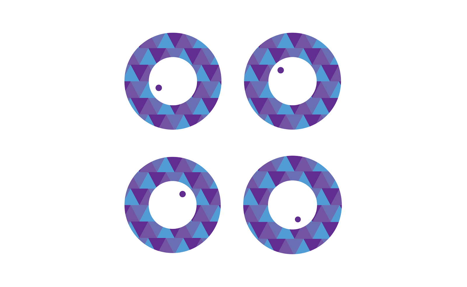
I firstly re-developed and finalised the design to make sure I was completely happy with it and wasn't going to need to make more changes. I created a primary logo which would consist of the O 'eye', and the secondary logo which would be the whole word 'OH!', both of which with versions that would work on light and dark backgrounds.


Here is how it looked using the patterns -
Primary Logotypes on selected backgrounds
I decided that on a white or light background this logo works best with a slight drop shadow to make the white outline visible. There may be circumstances when this may not work so I will have to consider this.

I really like how the logo works on a purple or black backdrop - will have to keep this in consideration when for when creating the rest of the graphic material.


Not so sure about the pattern being used extensively - quite overwhelming.

Think this pattern is more aesthetically pleasing but is less balanced in design because of the uneven square colours

Secondary Logotypes on various backgrounds


Again quite off-putting with the pattern as a backdrop -

I still really wanted to work with the concept of adaption - the logo visually 'adapting' to its surroundings, but I decided to take a different approach to what I had initially thought about doing.