STUDIO BRIEF 5 FURTHER RESEARCH |
I decided to focus my research and look into more simplistic packaging design that I felt could work well with our product -

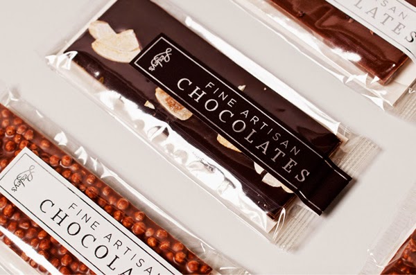
-Not really simple at all but absolutely love this.
- Amazing luxurious aesthetic - practical packaging
- Emboss looks delicious
- Packaging shape really nice and product is visible
- The design really compliments the product
- Probs be very expensive like...


- Really clean and simple - could work with the brownies?
I like the brown paper/card
- Minimal graphics
- Product fully visible
- like the idea of a sticker - hand packed?

- This is quite simple and sweet
- I like the way the label comes onto the die-cut bit
- shape makes it quite appeaing


- Sturdy box would keep product protected from damage
- Again I like the way the product is fully exposed and the label comes across it
- Graphics TOO simple? Ignore the graphics

- Paper sort of bags would be interesting although product is hidden
- Would it work with a square brownie? would be good for a 'brownie bits' product
- Rough printed texture really cool though

- Purely looking at the box here - small die cut? Still seems slightly hidden

- Really nice actually
- Small shape die cut works really well
- compliments packaging shape and graphics
- Plastic wrap looks really appealing here actually
- Will have to look into the different sort of plastics there are
- Simple graphics are really clear and distinctive
- Classy?


