STUDIO BREIF 5 INITIAL PACKAGING RESEARCH |
Looking into existing packaging design for artisan baked goods and similar products. I felt this would give me a better understanding of how the products could be packaged as well as directing aesthetic decisions.

- Really like the aesthetic of the brown card boxes - gives a bit more of a rustic feel.
- Die cut to show the product - not hidden
- Nice splash of colour to distinguish each product - contrast well with the white & brown
- How can I print on brown card without screen printing?


- Nice vintage style design
- Not really sure how well it works as a set - looks like different brands
- Product not protected though - probably wouldn't look as nice wrapped

- Like the idea of a see through plastic wrapper - fully see the product
- Maybe a bit too much going on with the design
- Works well as a set
- Kind of ruins the homeliness of the product though... ARTIFICIAL
.jpg)
- I find this quite weird - not really sure what to call it - card vac-pack?
- Really doesn't look like a food product - looks like packaging for something not edible
- Interesting but really not the direction i want to take
- Too much shit going on with the design

- Quite bespoke and classy
- Looks like a bar of soap
- Too much packaging - why would you want a brownie wrapped up so much - seems a bit pointless and over the top as nice as it looks.
- Would work as a gift but hiding the product in so much crap just seems stupid


- More of a gift box than anything
- Does look quite appealing but I don't like the idea of hiding the brownies
- Colour choice doesn't really work

- Quite garish colour choice but love the way the product is fully exposed
- Like the idea of a tray for the brownies to sit on and then a plastic wrap
- Looks quite classy - gender mutual

- Looks ok I suppose - not keen on the use of photos when the product is literally behind it
- Nice colour schemes - works well as a set
- Far too much shit on the box - do people actually read all that?
- Waste of ink - only going to be thrown away
- Just really takes away the realness of the product


- I like the way the product is fully exposed - as vile as it looks
- Hate the sticker design
- Would work well if done better - cheap and simple - plastic wrap and sticker

- Really interesting - nice aesthetic and colour schemes
- Too over the top with graphics?
- quirky packaging shape - reminds me of Tesco's sandwiches though
- probably expensive to produce

- Love the pattern design
- Really appealing and engaging
- Works well as a set
- Product is hidden but it kind of works - makes you exited about what is inside.

- Really appealing design and presentation
- Plastic wrap - heat sealed
- Colours work really well to represent the flavours
- Again product is hidden but packaging makes you want to find out whats inside
- Slightly artificial looking - do I want to keep away from this?


- Again really appealing design and presentation
- Artistic and engaging
- product is almost as interesting as the packaging
- brown matt stock creates quite a rustic quality
- Die-cut to show product - works really nicely with the design


- Really like the box and die cut
- Looks really girly/childish though

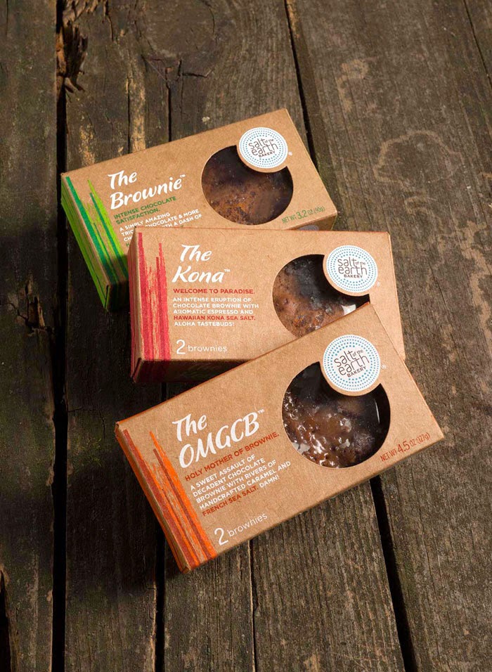
- Amazing brand identity
- works well as a range - really distinctive, enticing and original
- Not sure how well this sort of thing would work with the brownies though


- Quite like the packaging itself - plastic wrap and sticker?
- Looks slightly messy though
- Wouldn't say it was very homely or classy
- Gender mutual

- Quite like the idea of a tag
- Really simplistic - the brownie is on show but so is the brand
- not sure how 'professional' this looks - slightly too home made?

- These don't look too bad at all - ignoring the graphics
- I like the idea of a plastic wrap and sticker but also creating a bespoke box with a ribbon and tag if they were to be given as a gift?

- I think these work really well too - completely stripped back
- plastic wrap, sticker and ribbon
- The products themselves make the 'design' appealing
- The brand is still visible - maybe slightly more could be added
- cheap to produce?

